Introduction
WYSIWYG refers to “What You See Is What You Get” and refers to the text box used when designing emails and forms. You will see this WYSIWYG throughout the CharityEngine platform though forms, email templates, websites, and more. The benefit of using a WYSIWYG is that when designing your content, you are getting a live preview of what your donors will see in the exact way they will see it.
Designing with the WYSIWYG
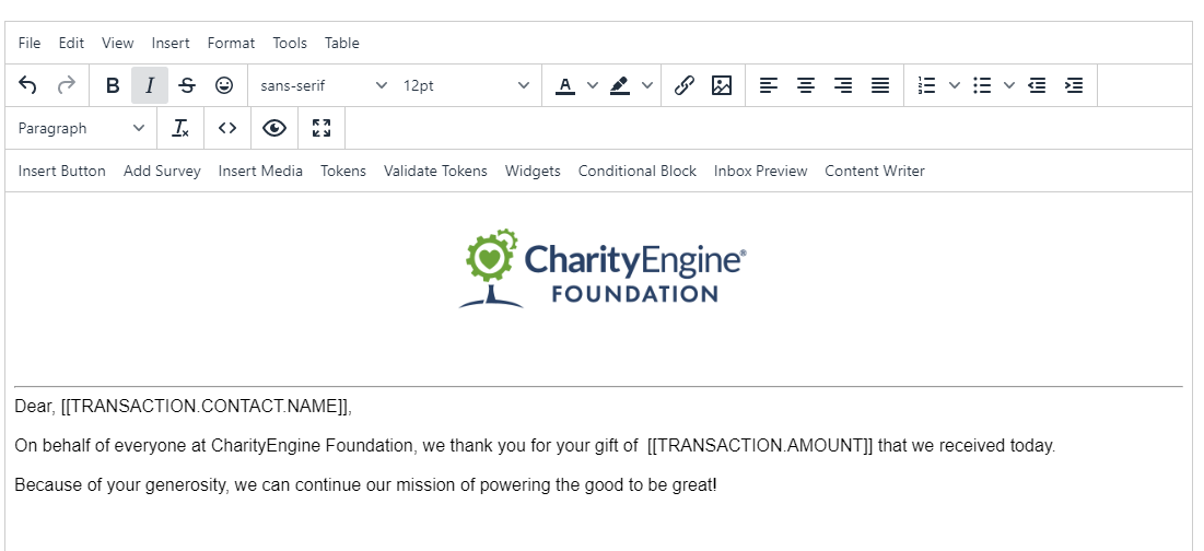
In this sample, we copied the Standard Donation Email and added our own language and an email to create a branded email that is more personalized with a logo and images and includes more targeted language. This was created entirely in the WYSIWYG.
Tips for using the WYSIWYG
The WYSIWYG editor works relatively similarly for emails and forms
Insert Menu
Use this dropdown for adding design elements:
Images
Tables
Media
Horizontal Lines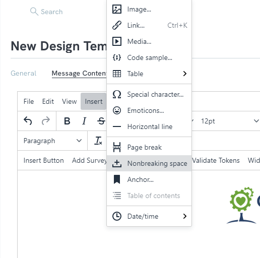
Insert Merge Tokens:
Use this dropdown for adding dynamic tokens that will fill in based on the transaction data. Select the fields you want to add. Field highlighted in green will be inserted. Click Insert to add.
Layout Bar
If you have ever created a word document, you will know how to use the layout bar.
Working with Images
If you want to include images, here are some tips on adding and editing:
1. Insert the image: Use the image Icon on the layout bar to insert your image
2. You can either use the URL of the image or upload from your desktop.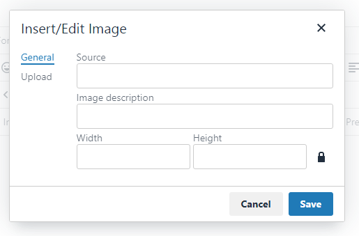
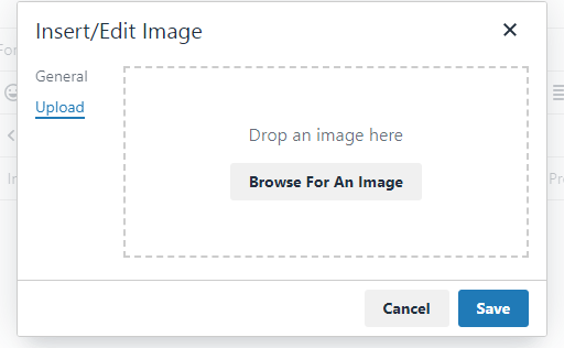
3. Edit you image by clicking on the image, then clicking on the image icon in the layout bar.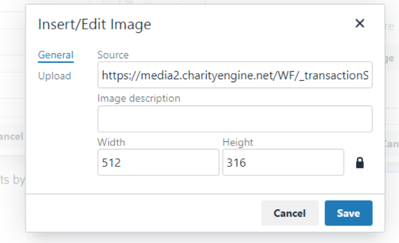
Note: To ensure that your image fits properly in the email, make sure that the dimensions of the image are no more than 700 pixels wide.
FORMS: Adding Images & Text
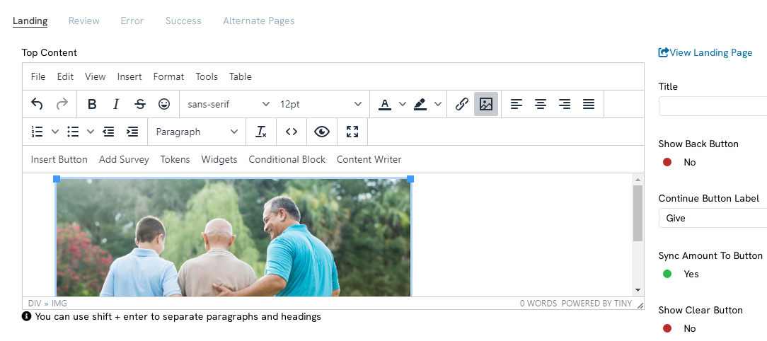
To add images or text to the form, go to the Content Tab.
You can add images and text to the Landing, Decline
As you can see in the image, the editing for the Top part of the form was done in the Top Content Section. You can also add content on the bottom of the form and that will go in Bottom Content.
When done designing,
FAQs & Additional Materials
Q. Where can I learn how to leverage auto-responders?
A. Learn more in our article Web Forms: Using Email Auto Responders with Forms
For additional information regarding creating forms click Here
